All work
- Client
- innogy
- Role
- UX designer, leading the UX of the project
- UX leadership
- User testing
- Data analysis
- Prototyping
- Axure RP
- Figma
Impact
- active users
- 78k
- rating on Google Play (October 2019)
- 4.6
- rating on the App Store (October 2019)
- 4.5
01
The brief
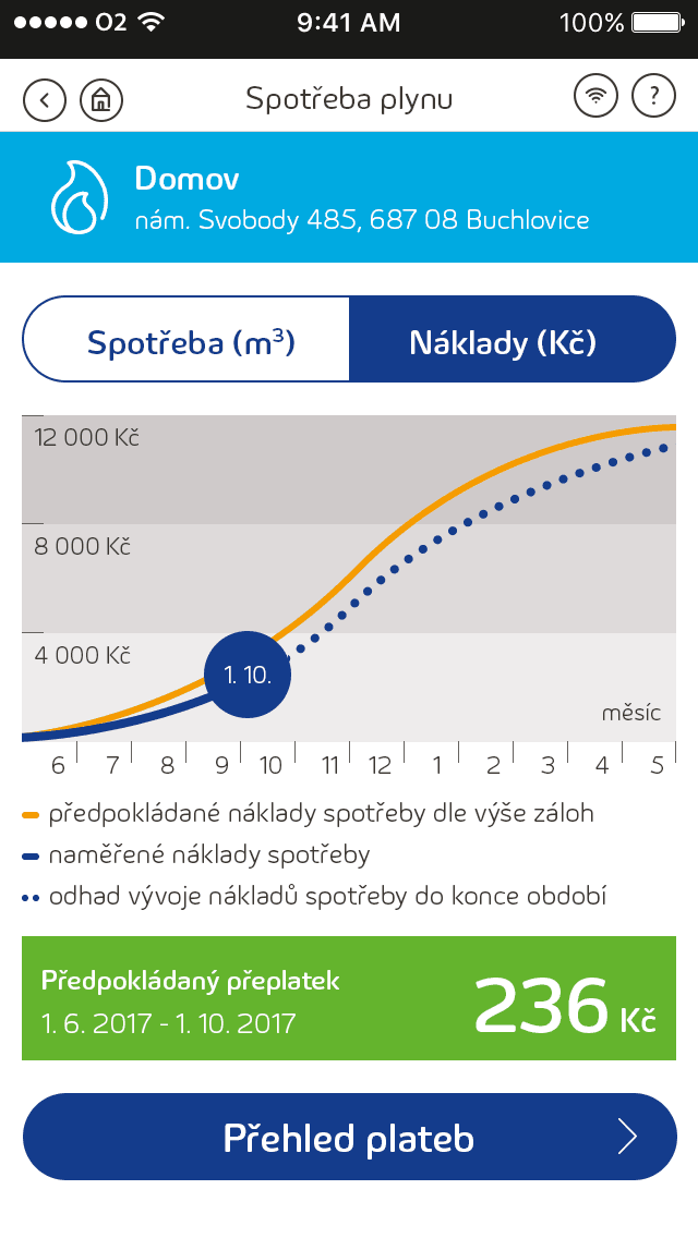
An iOS and Android app that shows real-time energy consumption, billing information and smart insights, with more features planned along the way.
02
My role
Present complex data through a clean interface that feels simple, even to someone opening the app for the very first time.
03
Process highlights
- 01Research into what users really need: usage trends, bill reminders and a quick way to contact support
- 02User flows for consumption graphs, push notifications and usage comparisons
- 03Prototypes and usability tests to refine the navigation and the dashboard
- 04Close collaboration with developers on both platforms
“This system helped me very much to see how much I need to adjust my monthly payments.”
04
Looking back
The project was hard, but it grew both my design skills and my soft skills, above all communicating with the team and the client to reach decisions that benefit both sides.
Recognition
3rd place
Other services
Effie Awards 2018
Explore more
Key takeaway
Complex data can be made clear and even motivating, and good design leaves room for the product to keep growing.